My movie poster compared to a real movie poster
My Movie Title
For my movie poster I wanted to have a unique font for the film title to do this I went on to the website www.dafont.com as it has a variety of fonts that would be useful for my movie poster. The font that I found was called 'horror scribbles' I liked this font as I thought that it tied in with the horror genre.
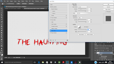
As there was a lot of black in my movie poster the colour of my title could not be black therefore I had to change the colour of it to suit my movie poster. to do this I took the fill paint tool and changed each letter to red. After I changed the colour I still wanted the movie title to stand out a lot more therefore I added an outer glow, drop shadow and inner glow to the title.
Most professional posters do not have gold five star ratings therefore I went onto Photoshop and changed the colour of the stars to white as it makes my poster look a lot more professional
Before
After

Movie poster construction


No comments:
Post a Comment